Plant Hire | Facilities Management | Construction
Phahama
Background
Phahama approached Pixel Menjic at a point where the business was ready to move beyond a basic identity and develop a brand system that could support its future growth. The company operated across plant hire, facilities management and construction, which meant the identity needed to feel credible across both heavy-duty industrial work and corporate service delivery.
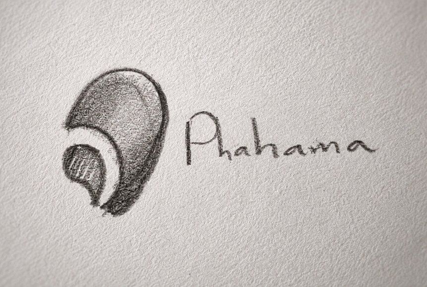
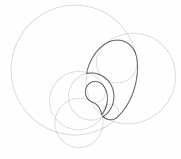
During the early discovery conversation, the client described where he wanted to take Phahama as a business. While listening to that vision, I began sketching the foundation of the logo concept, a mark that would keep the existing brand idea alive, but refine it into something more professional, memorable and scalable.
The project began as a brand design proposal focused on logo rework, stationery design and uniform design. The goal was not to throw the brand away, but to give it a visual facelift while preserving the concept elements that already had meaning for the client.
Challenge
The main challenge was to create one visual language that could represent three different service areas without making the brand feel scattered. Phahama needed to sit comfortably in the world of plant hire, construction and facilities management, while still looking distinct from competitors such as Talisman, Coastal Hire, Concor, Balwin Properties, Servest and Bidvest.
The brand also needed to communicate trust. In the construction space, a strong identity is not just decorative, it helps build awareness, credibility and recognition. The original proposal identified that growing a construction business requires proactive branding, because a consistent identity can tell the company story, increase awareness, build trust, set the business apart and inspire employees.
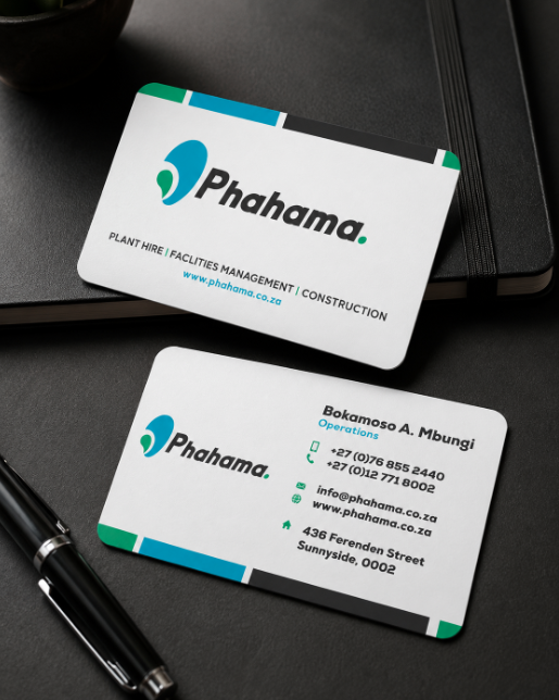
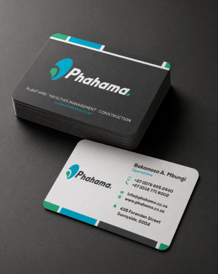
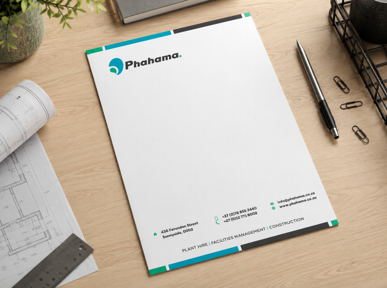
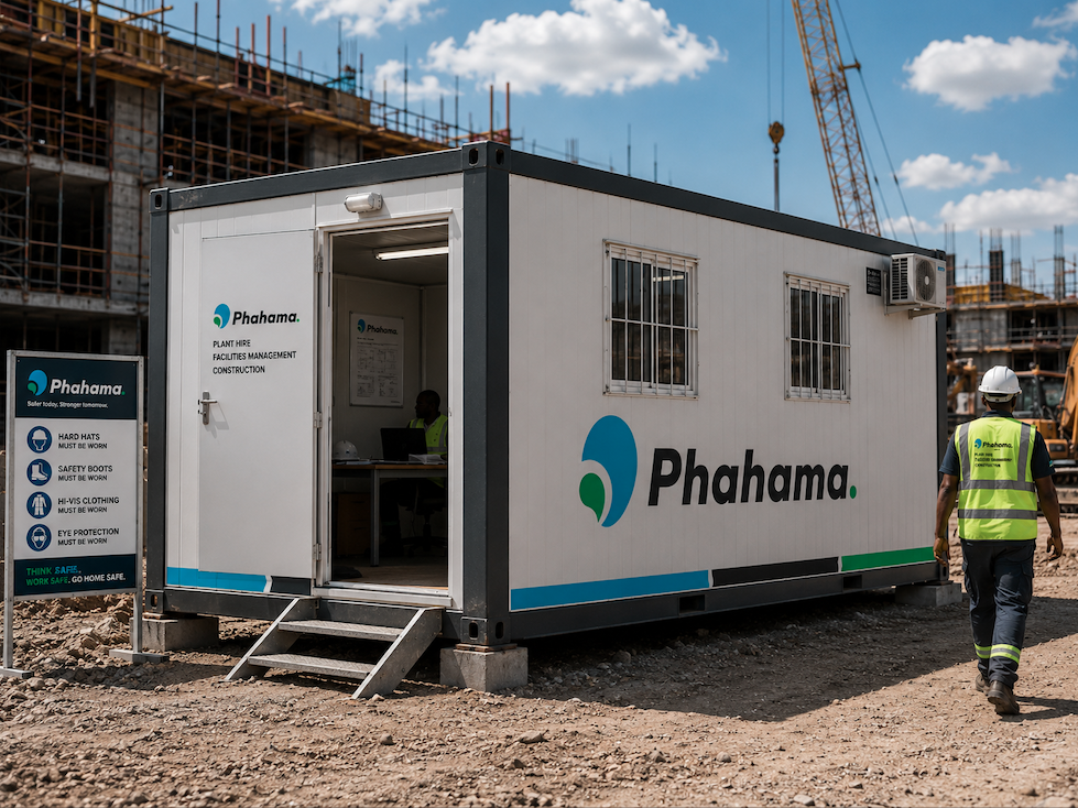
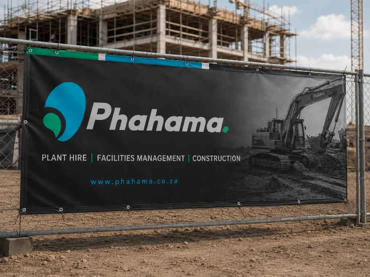
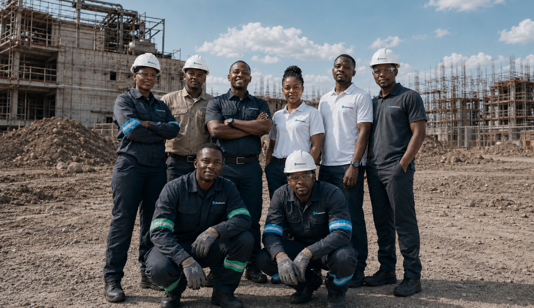
Visually, this meant refining the logo, strengthening the typography, defining the colour palette and applying the identity across practical items such as business cards, letterheads, uniforms and branded site applications.
Outcome
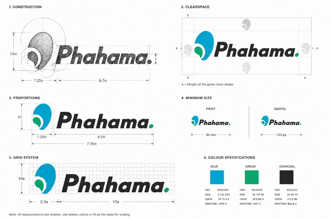
The final direction gave Phahama a cleaner, more confident and more industrially appropriate identity. The logo was refined using a customised version of Nexa Black, with adjustments made to the bends of the lettering so that the thickness felt consistent throughout the wordmark.
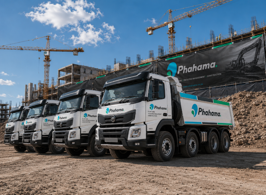
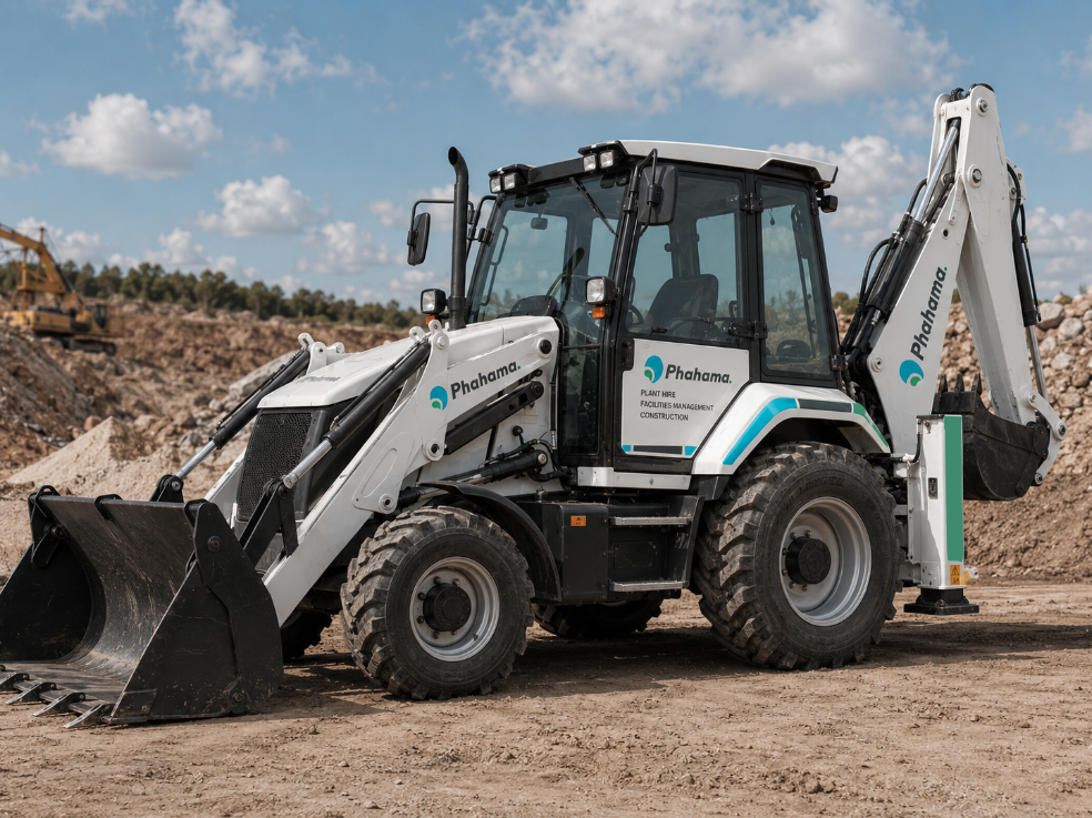
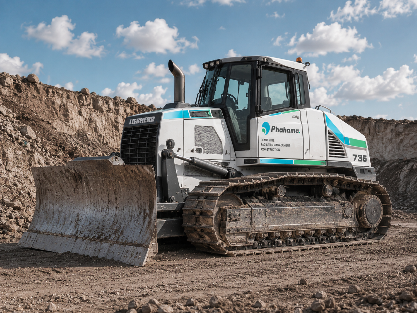
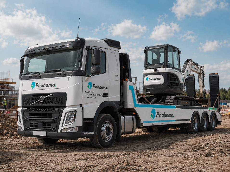
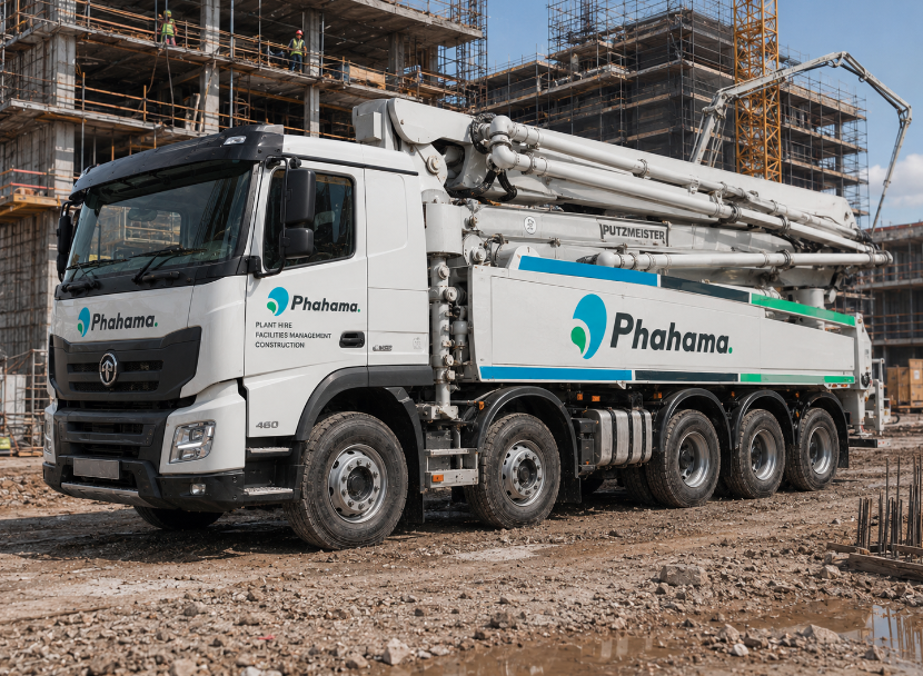
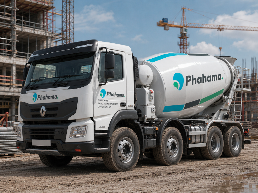
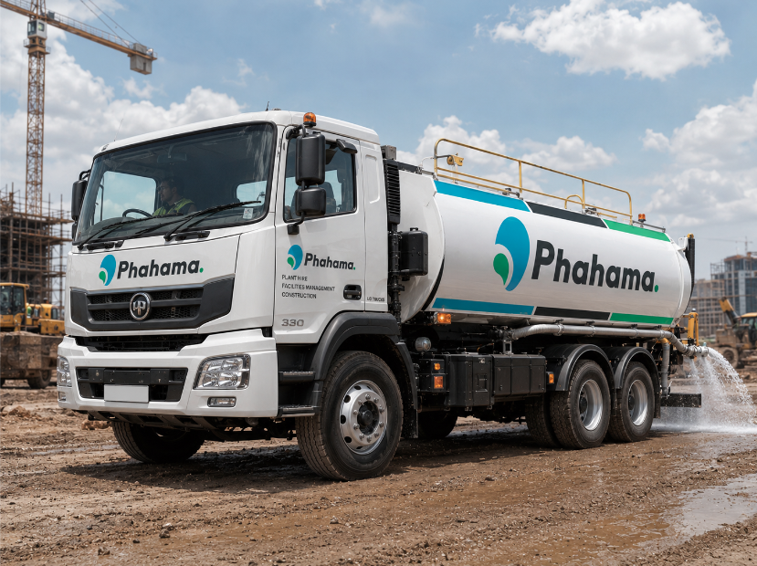
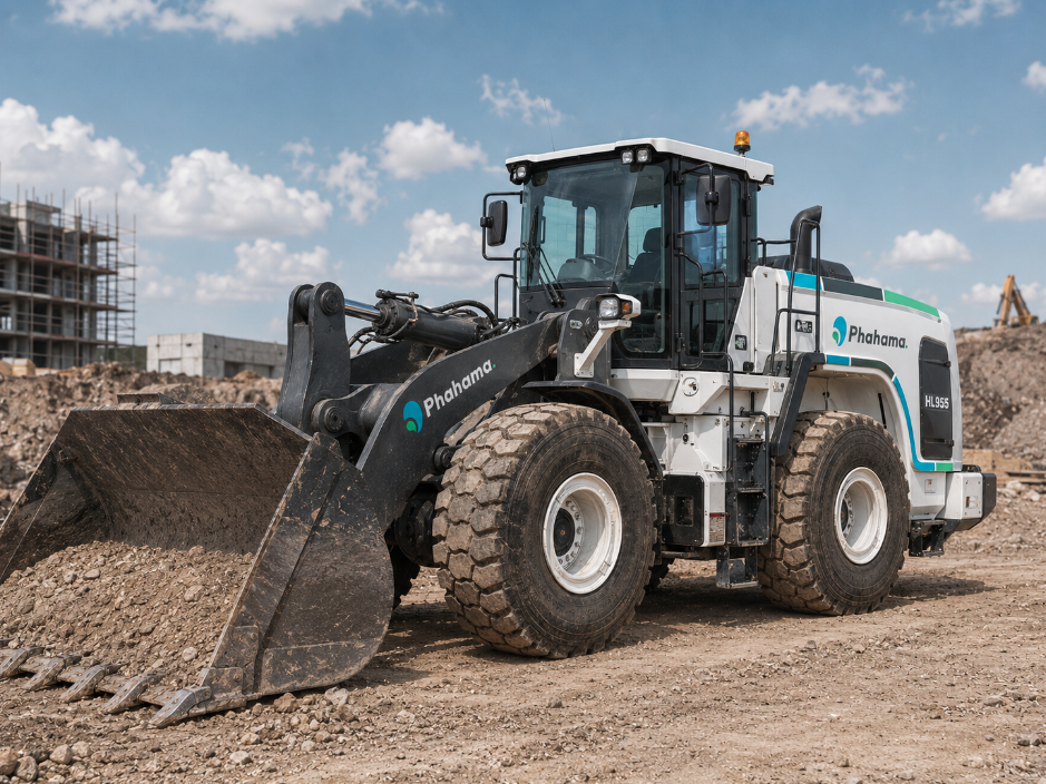
The colour palette was also tightened into a strong combination of Dusty Cyan, Ocean Green and Charcoal, giving the brand a balance of professionalism, energy and industrial strength. These colours became the foundation for the stationery, uniforms and later mockup applications across plant hire vehicles, construction sites, safety signage and branded workwear.
The result was a brand system that could grow with the business, from a refined logo and business cards to uniforms, vehicle branding, site signage and construction-sector collateral. The proposal positioned these as building blocks for Phahama’s next stage, including research, website design, logo retouching, copywriting, stationery, vehicle branding, uniform design, social media and a company profile.
Client
Phahama
Industry
Plant hire
Facilities management
Construction
Project
Corporate rebrand
Services
Logo rework
Brand identity
Stationery design
Uniform design
Vehicle branding